Wedding Fonts Are a Feeling Before They’re a Word
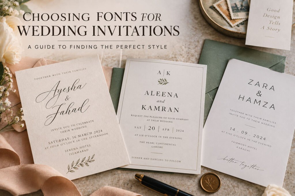
Think about the last time you saw a wedding invitation online and immediately had a reaction to it — “oh, that’s elegant” or “that feels so them” — before you’d actually read the names or the date. That reaction is almost always coming from the typography, not the layout or the color scheme. Typefaces carry emotional weight the same way music does. A slow piano piece and an upbeat pop song can announce the same event completely differently, and fonts work the same way on paper (or on screen, if you’re going digital).
This is why “just pick something that looks nice” tends to backfire. A font can look beautiful in isolation and still feel completely wrong once it’s sitting next to your specific wedding — your venue, your colors, the overall vibe you and your partner are going for.
Script Fonts: Romantic, Traditional, Soft
Script fonts — the flowing, cursive-style lettering you see on most “classic” wedding invitations — read as romantic almost by default. They’re the safest choice if your wedding leans traditional, garden-style, or softly elegant, and they pair especially well with florals, watercolor textures, and warmer color palettes.
The catch with script is that it’s easy to overdo. A whole invitation set in heavy script becomes genuinely hard to read, especially for guests scanning quickly for the date and time. The trick most designers use is pairing a script font for names or a headline with a simple, clean font underneath for the actual details — date, time, address. You get the emotional warmth of the script without sacrificing legibility where it actually matters.
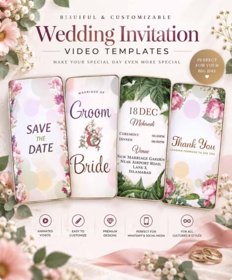
This pairing is exactly what you’ll notice in a design like our Royal Purple Wedding Invitation— a flowing script sits at the top carrying the names, while the logistics underneath switch to something far more restrained.
Serif Fonts: Classic, Formal, Timeless
If script feels like a whisper, serif fonts feel more like a steady, confident voice. These are the fonts with the small decorative strokes at the ends of letters — think formal wedding stationery, or the kind of typography you’d see on an old book cover. They read as established, traditional, and a little more formal than script, without tipping into overly decorative territory.
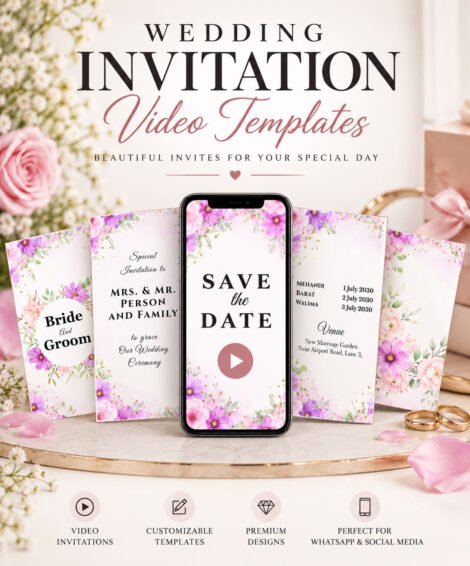
Serif fonts are a strong choice for black-tie weddings, cathedral ceremonies, or any wedding where you want the invitation to feel weighty and intentional rather than light and airy. They also tend to age well in photos — a serif invitation from a wedding ten years ago still looks appropriate today, where trendier display fonts can sometimes date themselves.Our Lavendar Floral Wedding Invitation of structured, classic typography, giving it a more grounded, established feel compared to something more delicate.
Modern Sans-Serif: Clean, Minimal, Confident
Sans-serif fonts — no small strokes, clean straight lines — are where a lot of modern couples land, especially for weddings with a minimalist or editorial aesthetic. There’s something about the simplicity that reads as confident rather than plain, particularly when it’s given room to breathe with generous spacing.
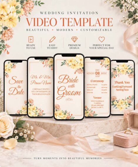
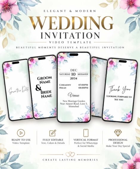
This is the direction to go if your wedding venue is architectural, industrial, or gallery-like, or if your overall style leans more Scandinavian-minimal than romantic-garden. Sans-serif also happens to be the most legible option across digital screens, which matters more than people expect now that a good portion of guests will see your invitation on a phone rather than in printed form.Designs like our Indian Modern Style Wedding Invitation and Golden Theme Wedding Invitation both use this cleaner, more structured typographic approach, which is part of what gives them that contemporary feel compared to the softer floral options in the catalog.
Playful and Hand-Lettered Fonts: Casual, Personal, Fun
For backyard weddings, brunch receptions, or couples who just don’t want their wedding to feel stiff, playful or hand-lettered fonts can do a lot of work. These fonts often look like they were actually written by hand — a little imperfect, a little bouncy — and they signal right away that this isn’t going to be a rigid, formal affair.
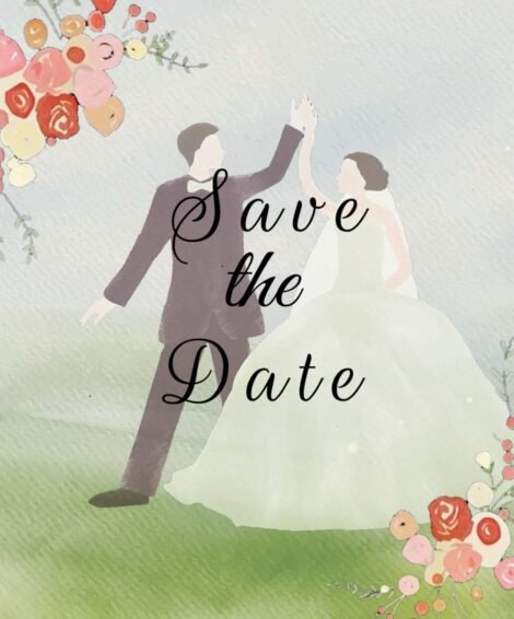
The risk here is the same as script: legibility. A quirky, highly stylized font might be perfect for the word “Save the Date” in large type, but painful to read in a full paragraph of ceremony details. Reserve the playful font for headlines and short phrases, and let something simpler carry the informational weight.
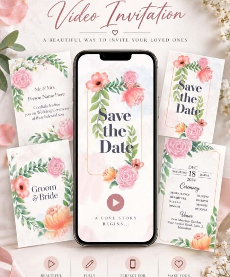
Our wedding invitations both lean into a friendlier, more relaxed type treatment that suits this kind of casual, personality-forward wedding.
The Two-Font Rule (And When to Break It)
If there’s one piece of advice worth actually following, it’s this: most well-designed invitations use no more than two fonts. One for emphasis — your names, a headline, a key phrase — and one for information — date, time, venue, RSVP details. More than two starts to look chaotic, even if each individual font is beautiful on its own.
There are exceptions. Cultural wedding traditions, like Indian wedding invitations, often intentionally layer more typographic and decorative elements as part of the visual language itself —
8 WeddingvFonts Worth Actually Considering
Talking about font categories in the abstract only gets you so far — at some point it helps to have actual names to search for. Here are eight fonts that come up again and again in real wedding stationery, across different styles, along with what each one is best suited for.
1. Playfair Display (Serif) A high-contrast serif with elegant, slightly dramatic strokes. Reads as formal and editorial without feeling old-fashioned. Works beautifully for names and headlines on black-tie or classic weddings — pair it with a lighter sans-serif like Lato for the details.
2. Cormorant Garamond (Serif) Softer and more delicate than Playfair, with a literary, old-world feel. A strong choice for garden weddings or anywhere you want “classic” without “stiff.” Pairs well with a simple sans-serif like Montserrat for contrast.
3. Great Vibes (Script) One of the most-used script fonts in wedding design for a reason — flowing, romantic, and legible even at a decent size. Best reserved for names or a short headline rather than full paragraphs. Pair with a clean sans-serif like Raleway for everything else.
4. Parisienne (Script) A slightly more relaxed, bouncier script than Great Vibes — less formal, a bit more playful while still reading as romantic. Works well for softer, floral-heavy invitations. Pairs nicely with Josefin Sans for logistics text.
5. Montserrat (Sans-Serif) Clean, geometric, and highly legible at any size — a favorite for modern and minimalist weddings. Holds up equally well printed or on a screen, which makes it a safe pick for digital invitations. Pairs well with a script like Alex Brush for a name treatment.
6. Futura (Sans-Serif) Bold, architectural, and confident — this is the font to reach for if your wedding leans industrial, gallery-like, or strongly minimal. Best used sparingly, in caps, for headlines rather than body copy, since its geometric shapes can feel cold in large blocks of text.
7. Amatic SC (Hand-Lettered/Display) A narrow, slightly rough hand-drawn feel that reads as casual and warm rather than polished. Great for backyard or rustic weddings, especially for short phrases like “Save the Date.” Not suited to longer text — pair it with a simple serif or sans-serif for the actual details.
8. Cinzel (Serif/Display) Inspired by classical Roman inscriptions, this font has a stately, almost architectural weight to it. A strong fit for cultural or traditional ceremonies that want a sense of gravity and permanence — it shows up often in the kind of detailed, ornamental typography used in Garden of Roses Wedding Invitation A quick rule of thumb when browsing fonts on your own: if you can find it on Google Fonts, you can usually license it for both print and digital use without any extra headache — which matters if you’re producing both a physical invitation and a digital version, as most couples end up doing now.
It’s easy to fall in love with a font because it looks gorgeous in a Pinterest screenshot, completely divorced from your actual wedding. A few honest questions can help pull you back to reality:
What’s your venue actually like? A delicate script font can feel a little lost against a raw industrial warehouse, the same way a bold geometric sans-serif can feel cold in a candlelit garden.
How formal is the day, really? Not how formal you wish it sounded, but how it will actually feel — cocktail attire and a DJ reads differently than black tie and a string quartet, and your font should agree with which one you’re actually having.
Will most guests see this on a screen or on paper? If you’re going digital-first, prioritize legibility a little more heavily than you would for a printed card guests can hold closer and take their time with.
Does it match your color palette’s energy? A bright, saturated palette paired with a delicate, muted script can feel like two different weddings colliding. Font and color should generally be pulling in the same emotional direction.
Trust the Pairing, Not Just the Wedding Font
One thing that trips couples up is evaluating a font completely on its own, outside of any real layout — but a font rarely lives alone. It’s paired with a color, a texture, spacing, maybe a floral illustration or a graphic border. A font that looks plain by itself can come alive once it’s set against the right background, and a font that looks stunning in isolation can feel overwrought once it’s stacked with five other design elements.
This is really the advantage of browsing complete invitation designs rather than trying to build font choices from scratch — you’re seeing the font the way it’ll actually be experienced, already paired with color, layout, and imagery that either supports it or fights against it.
Bringing It Back to You
At the end of the day, there’s no universally “correct” font for a wedding invitation — only the one that actually sounds like your wedding when you say it out loud. If you’re the couple who wants your invitation to feel like a warm hug, script and soft serif pairings will probably feel right. If you’re the couple whose wedding is going to be more art gallery than garden party, clean sans-serif will likely feel far more like you.
The best way to figure it out honestly is to stop looking at fonts in isolation and start looking at full invitation designs, the way your guests actually will. Browse our complete collection in the shop and pay attention to which ones make you stop scrolling — that instinct is usually telling you more about the right font than any style guide could.